Indigo
HEX #00284FRGB 0 40 79CMYK 100 50 0 70PANTONE 294
CASEBRAND IDENTITYGUIDEBOOK
A logo and a working brand style for an international trade & logistics company — shipped as a guidebook the team can actually use.
Ursus Trade moves goods across borders and needed to look like the company it already is: confident, precise, on the way up. We designed the mark, packed the visual rules into a compact styleguide and rolled the identity onto real carriers — from business cards to the door sign.
The mark merges an upward arrow with the letter U — trade volume going up. The logo is a fixed asset: it is never recolored, restyled, rescaled in parts or set in another typeface.



Three colors, no gradients. Readability and contrast between logo and background decide which version goes where.
Golos Text carries the brand: Bold for headlines, Regular for body copy. Arial is the system fallback for documents that must open identically on any machine — PPTX decks and Word letterheads.
Aa Бб 0123
URSUS TRADE — Надежные маршруты для роста вашего бизнеса
Aa Бб 0123
System font for PPTX & Word documents
The guidebook fixes clear space, backgrounds and photo rules so the logo survives real-world use.
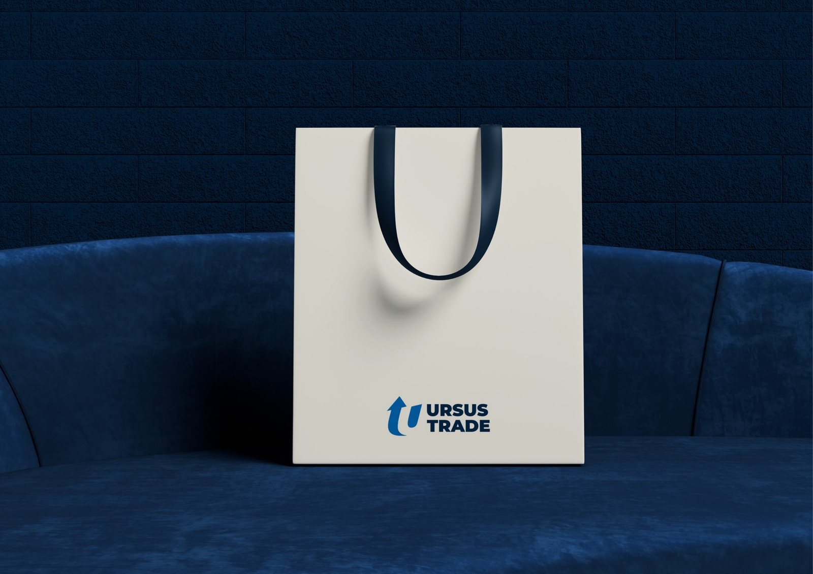
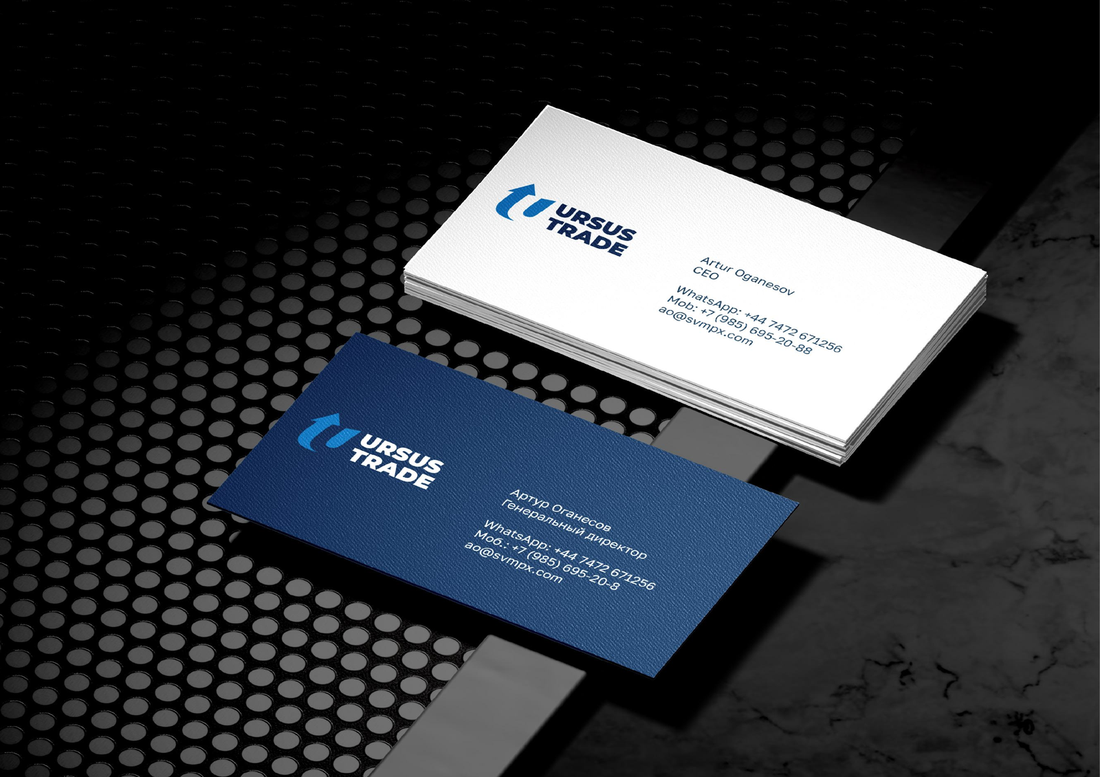
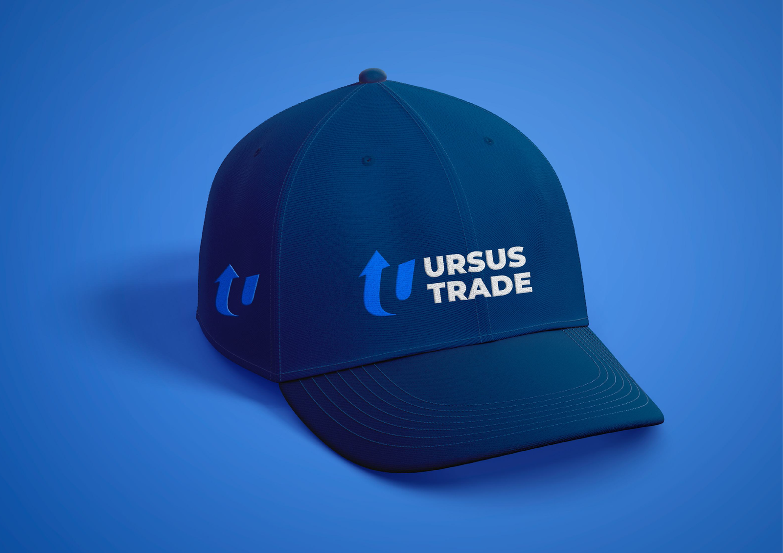
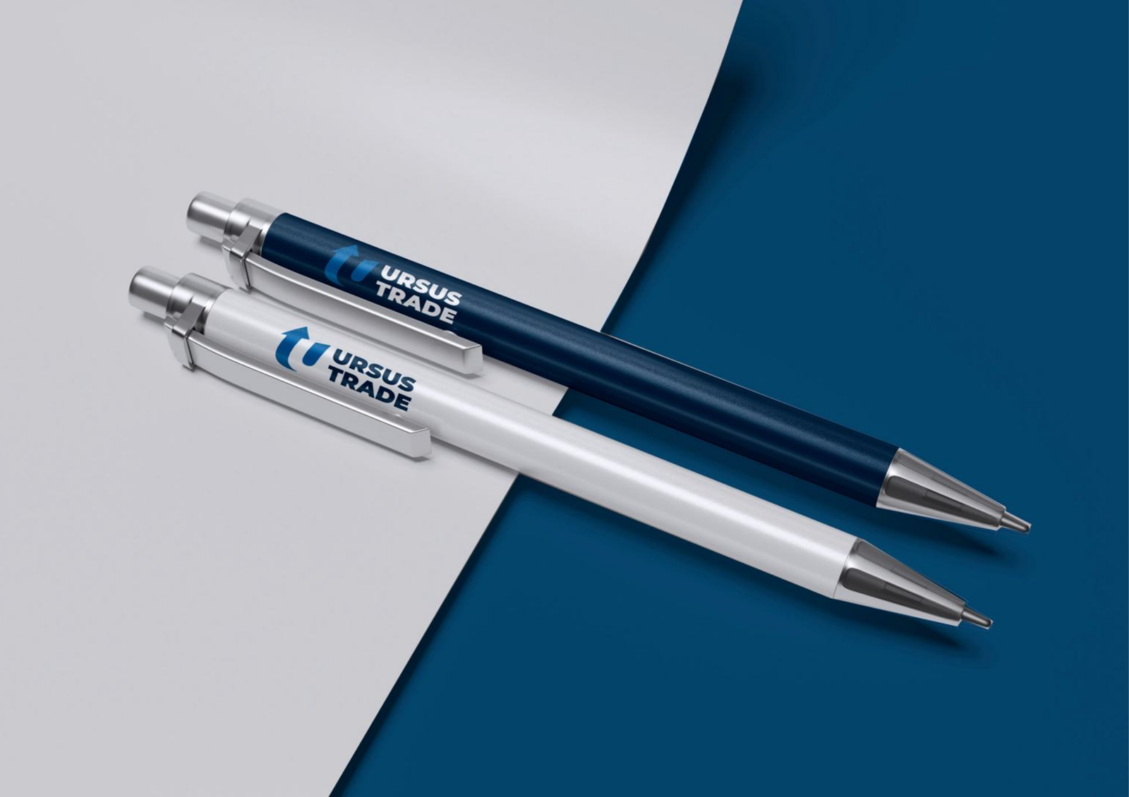
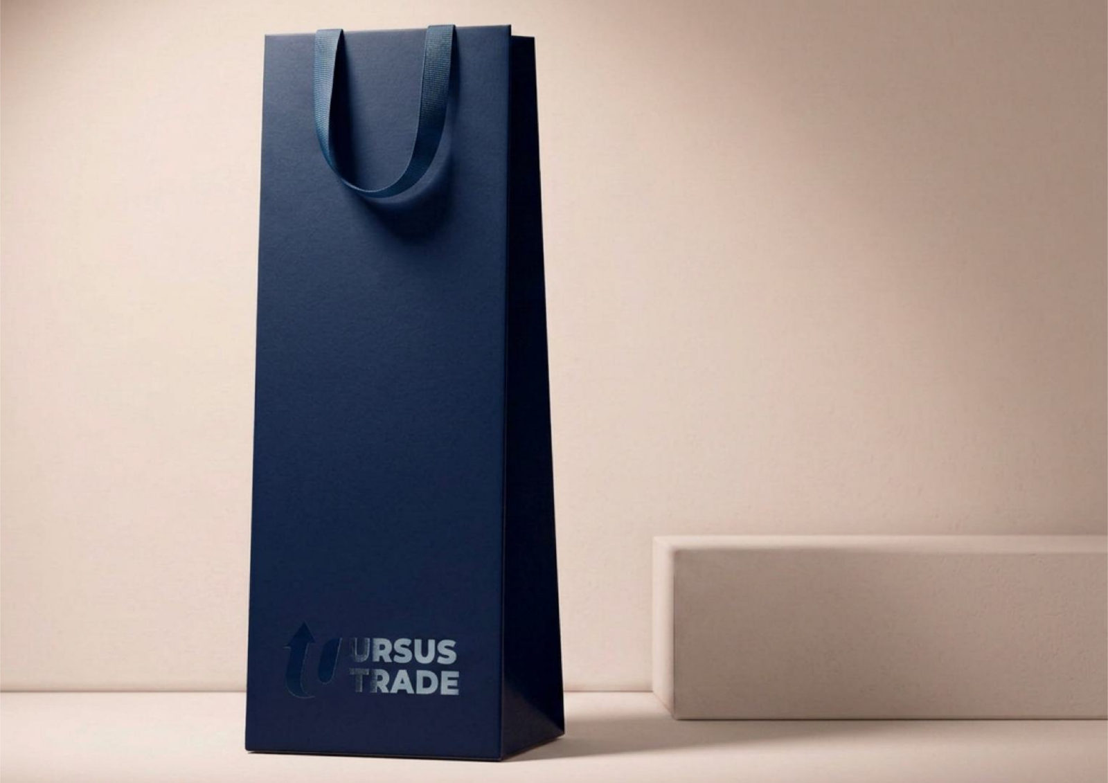
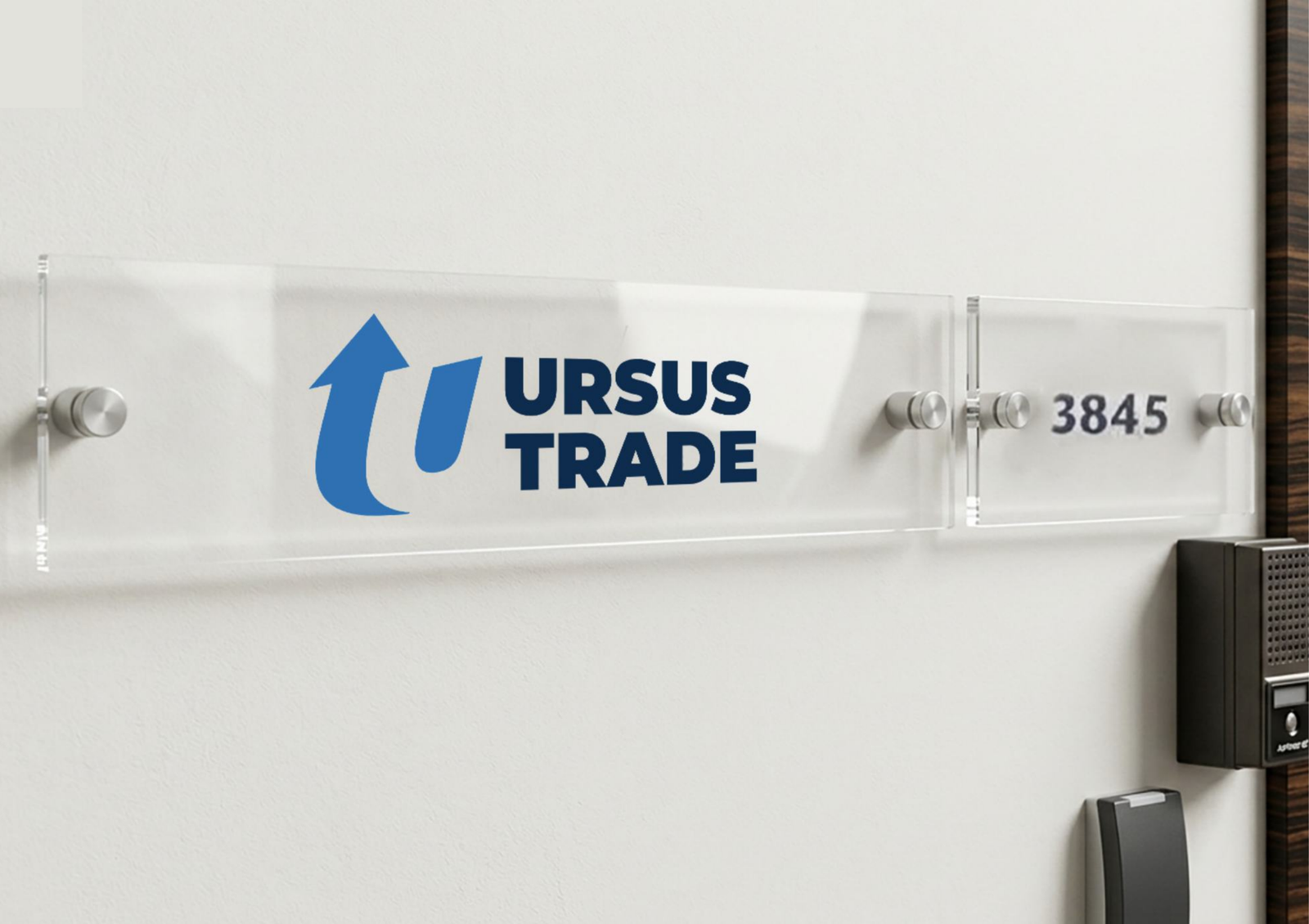
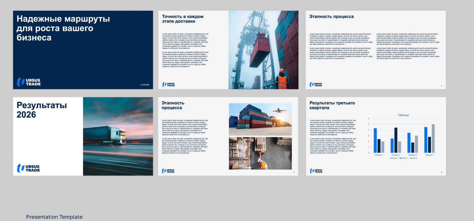
The identity was rolled onto physical and digital carriers with production-ready files: gift bags, stationery, merch, presentation template, e-mail signature and the office door sign.
Three passes in one month — each round shipped as a deck, collected comments and folded them back into the system.
Sign search around the arrow + U idea, color and wordmark fixed.
Mockups for bags, cards, pens, cap, sign; client comments folded in per iteration.
29-page rulebook: versions, clear space, prohibitions, colors, type, photo style, carriers.
WHAT SHIPPED